anxie.ty is a display font embodying the feelings of anxiety and fear, and its story is quite unusual:
anxie.ty is a display font embodying the feelings of anxiety and fear.
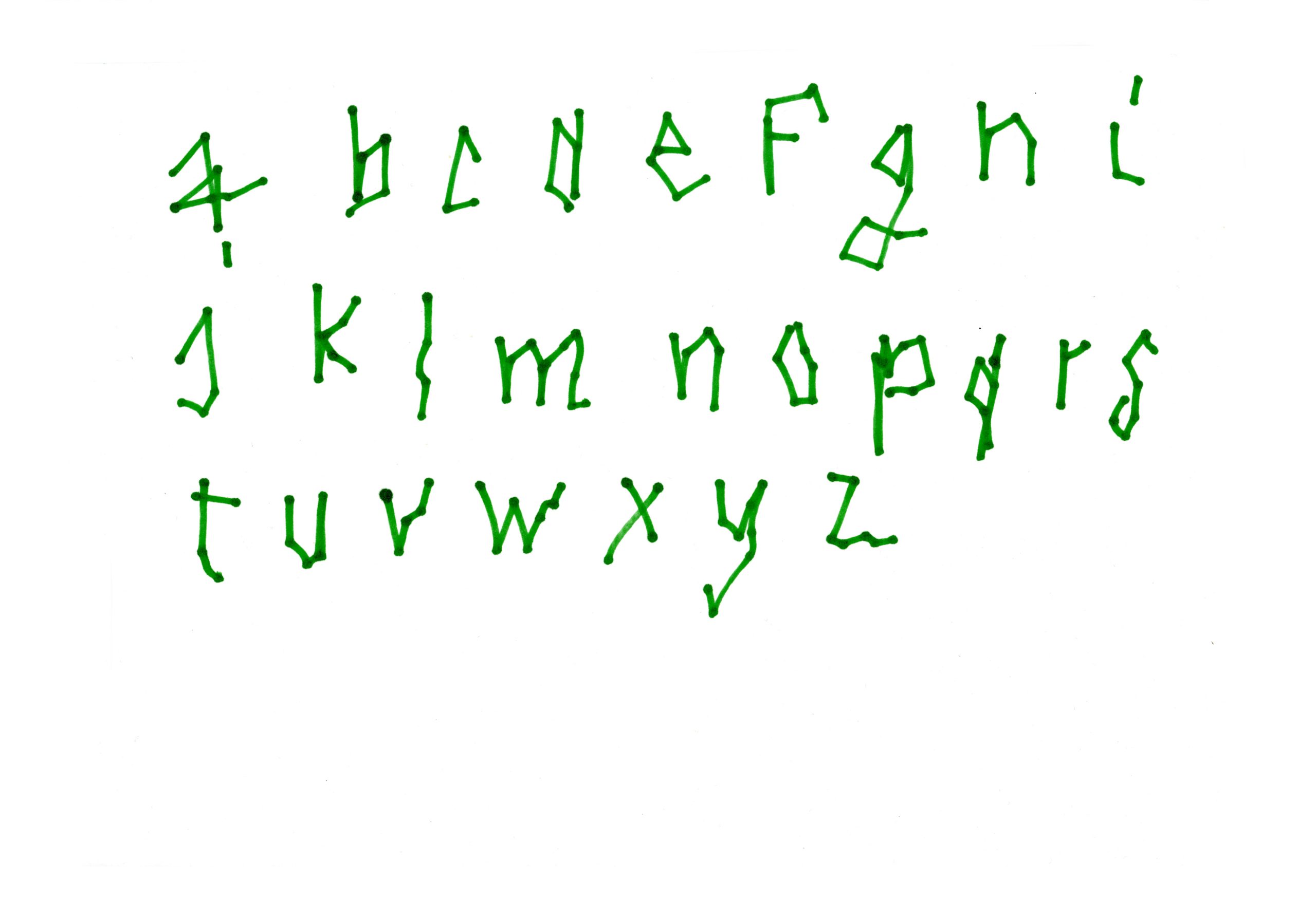
Extremely personal project, the creative process of anxiety is pretty unique, its first drawing made while I was having an anxiety crisis specifically triggered for the sake of its creation.
Shutters closed, white sheets of paper on the walls and a very specific playlist which goal is to trigger the anguish anxiety in me, the characters of the font have been drawn, among other productions, in the dark, eyes closed, and with a green marker pen.
Each letter was then redesigned with a grid of point in order to give uniformity and harmony to the whole body of work. This grid also helped with the readability of the font.
Finally, the numbers, some glyphs and the punctuation signs were drawn afterwards, borrowing some parts of the letters in order to stay in line with the originals proportions of the font.
Because it’s a titling typography, the readability of anxie.ty can be complex, just like our thoughts and emotions can be as well when having an anxiety attack.
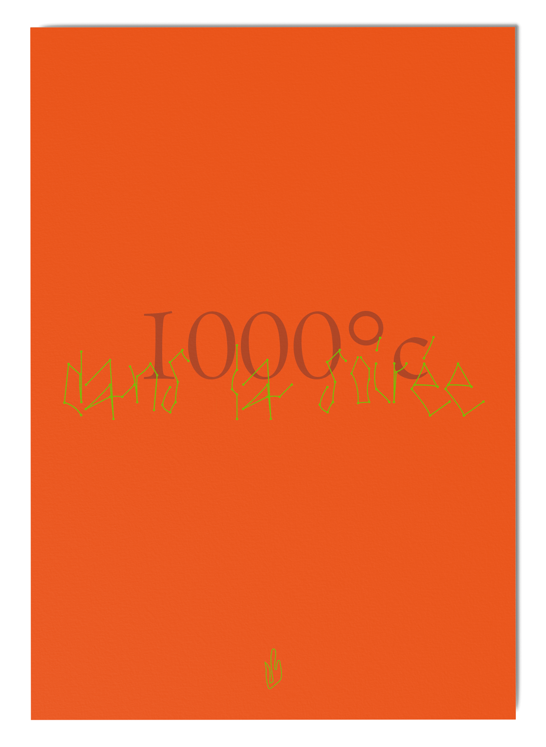
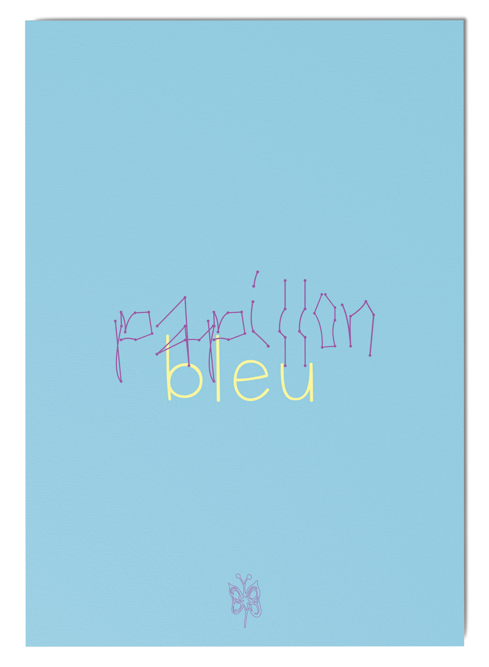
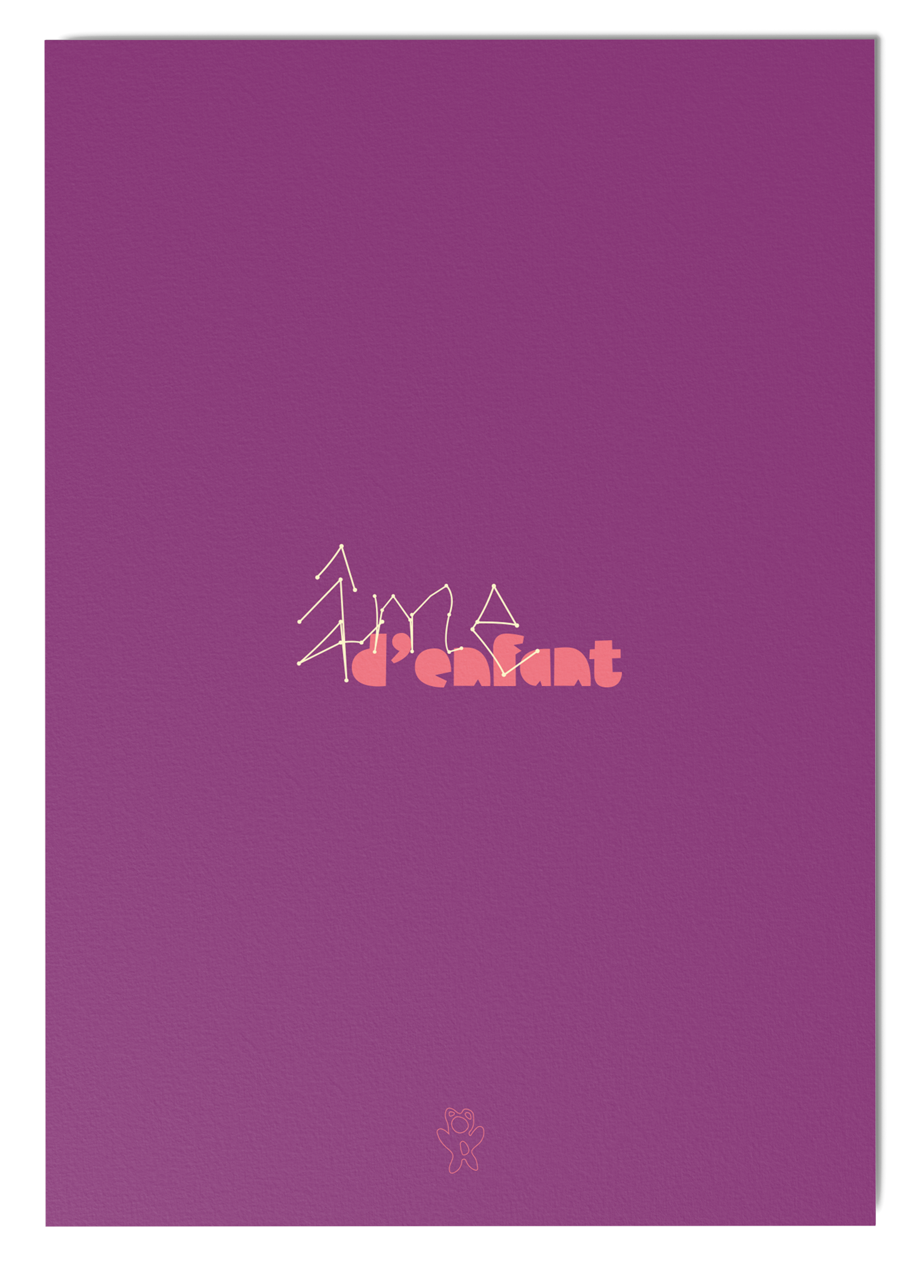
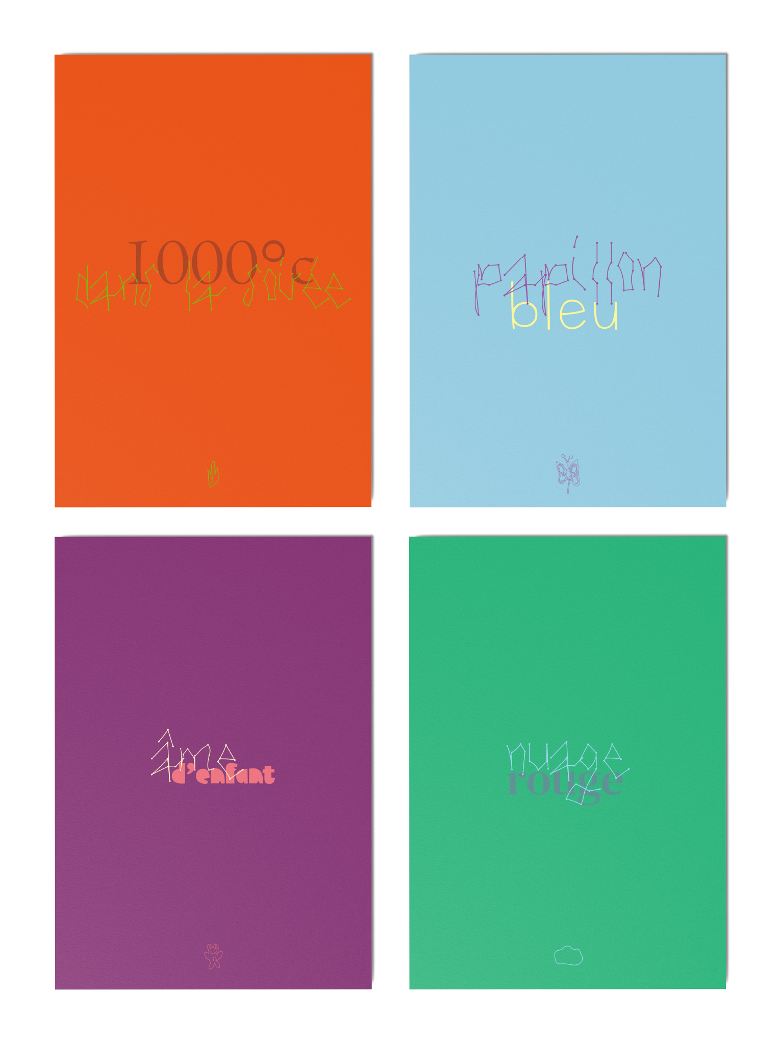
But every shadow has its light, and after several uses and analysis of the characters, their joints accentuated by the marker pen started to stand out. What was the very materialization of a crisis became the incarnation of one of my main source of light: the stars. Indeed, those stopping marker points bring a whole new dimension to the font, reminding of constellations.
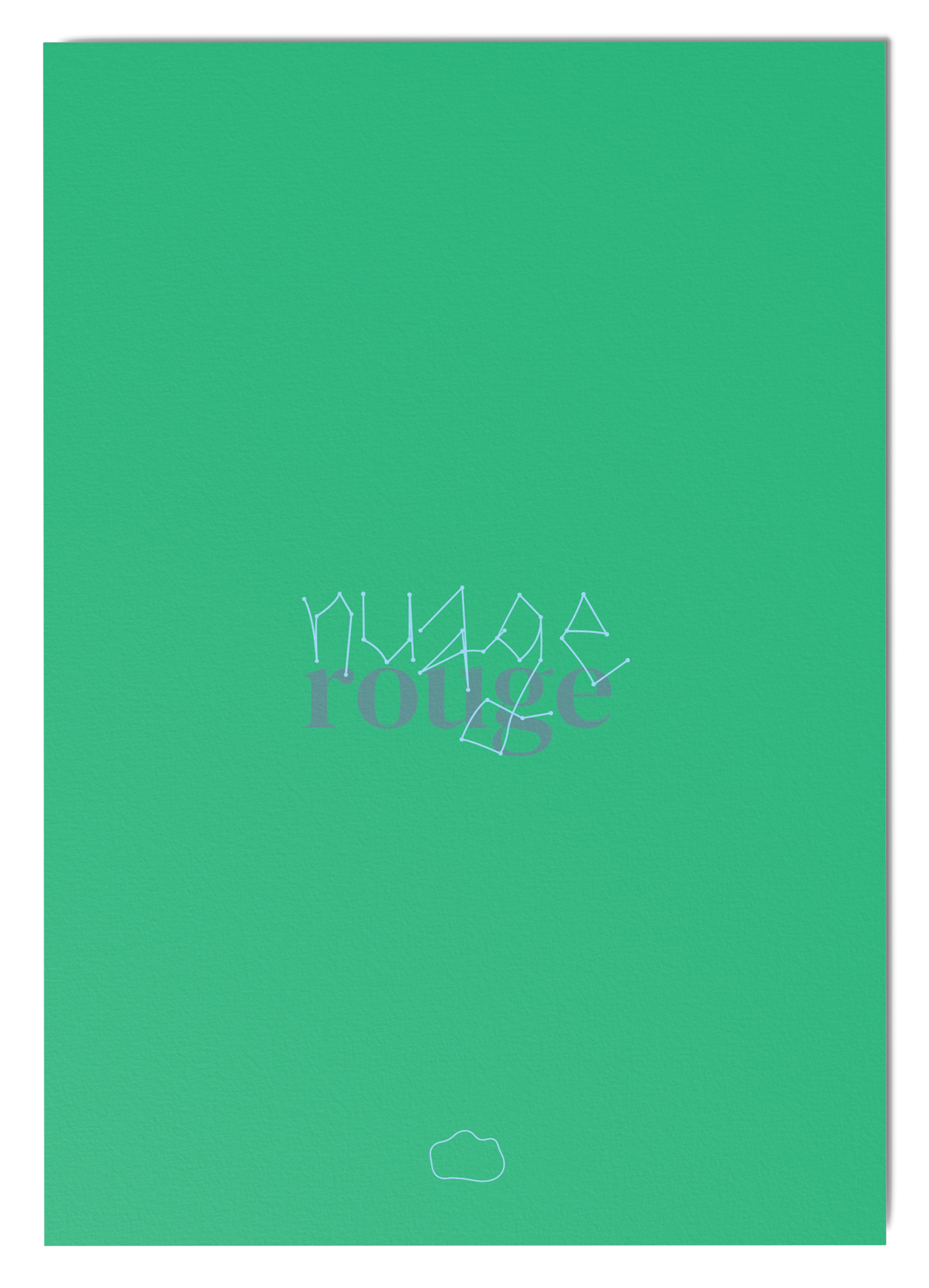
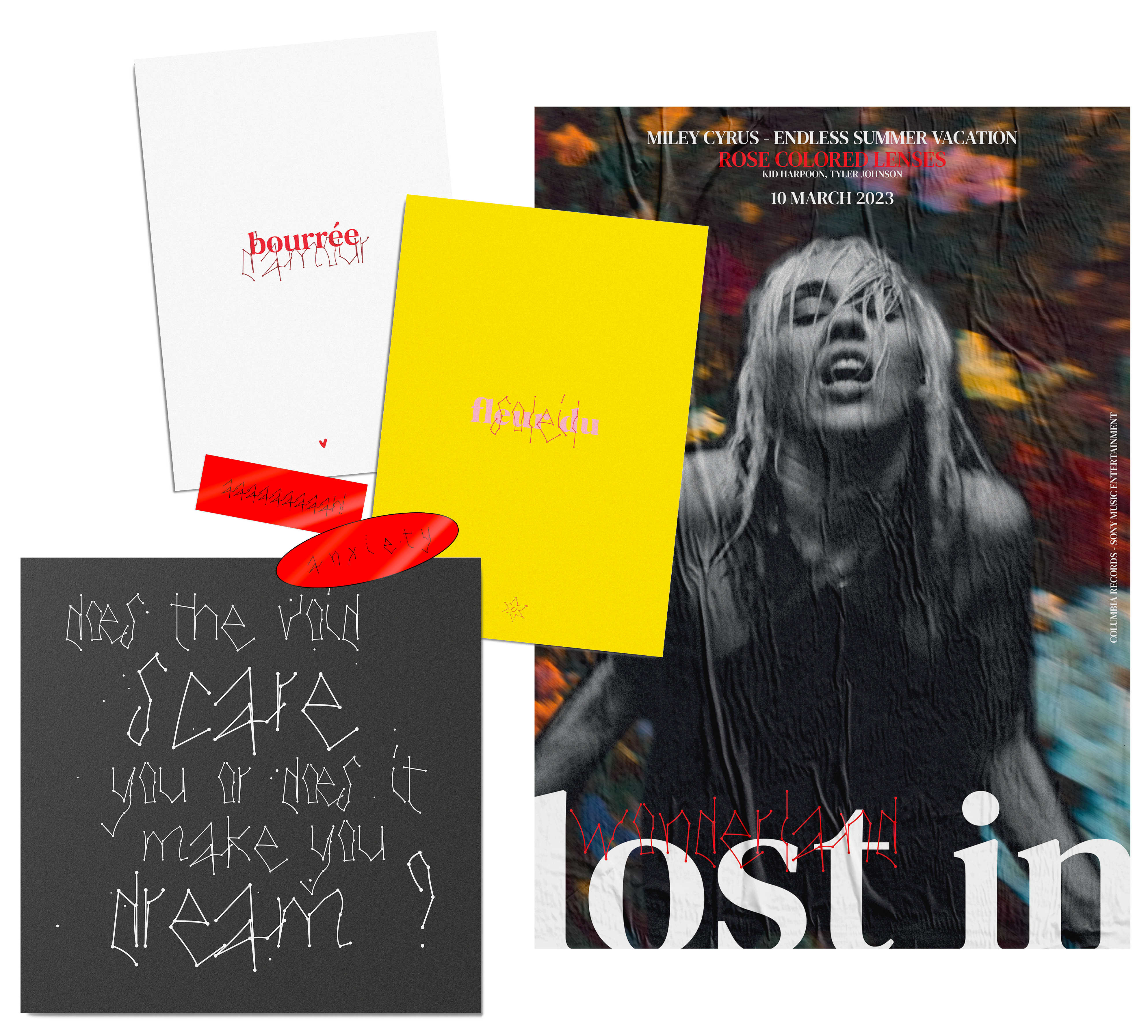
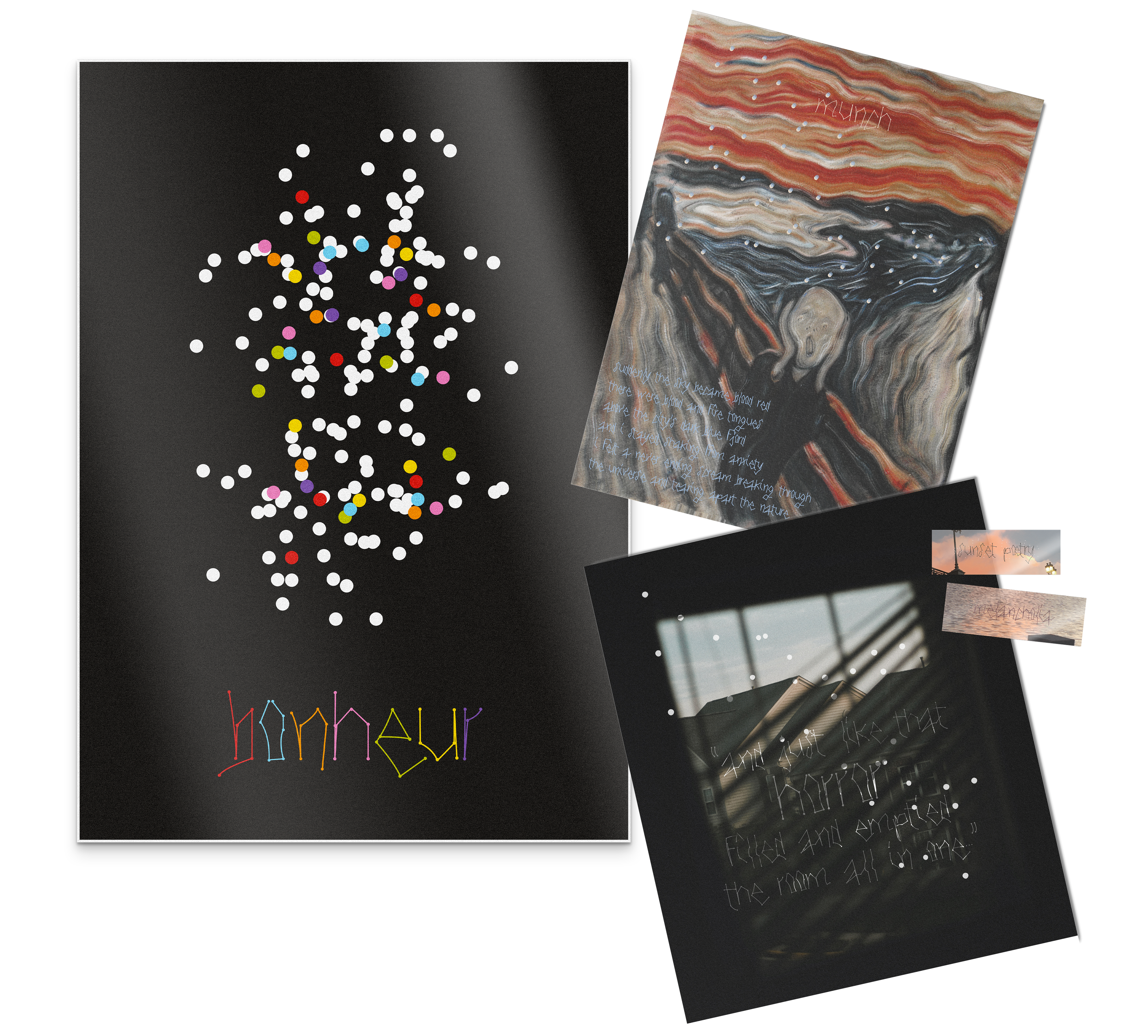
In the face of this observation, an alternative version of the typography was created, in order to dive more into this celestial side. The letters disappear, leaving space for clouds of dots.
Between mysticism and poetry, anxie.ty is shadow and light at the same time depending on what you want to see in it, its skeletal and oppressive aspect having the ability to transform into a mysterious and intriguing one in the blink of an eye.
The heavy and suffocating thoughts behind the creation of anxie.ty turned back on her, and made appear light in the middle of the darkness.